

First Draft
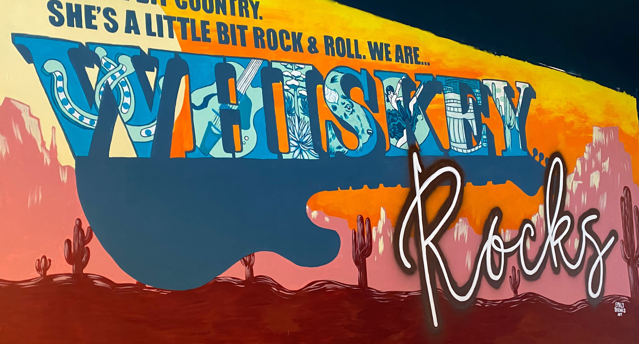
The team at Whiskey Rocks were initially inspired by vintage southern post cards. Our first draft of this design was heavily influenced by that vintage typography treatment. The illustrations within the confines of the type directly reference the bars various liquor partners.

Color Way
The bar’s decor features notes of vintage teal and rusty earth tones. The color was chosen to effectively mimic the colors of the bar.

Final Composition
Wanting to incorporate a more direct reference to their brand, the post card type was replaced with that of their logo, without compromising the illustrations within as to still reference the design roots.


Copper accents
During the painting process the team at Whiskey Rocks expressed their interest in incorporating a metallic copper element into the mural, as many accents within the bar are made of the metal. Through the use of speciality spray paint the effect was achieved and now shimmers in the sunlight of their front windows.
